Clearing is here! In the UK, UCAS Clearing is a critical and often stressful process for both students and higher education marketers.
With the intense competition to fill remaining course places post-application deadlines, universities have to stand out to attract and support prospective students effectively.
In a previous post, we shared a cheat sheet on how to optimize your higher education strategies for Clearing.
And this week, we’re showcasing how to do it, with eight exemplary universities that have optimized their Clearing strategies, demonstrating innovative approaches and excellent practices, each in their own way.
Each example highlights unique strategies, such as interactive videos, flowcharts, mini-websites, and social media integration, all designed to reduce anxiety and improve the overall experience for students navigating Clearing.
Here’s how these universities are making their Clearing approaches stand out.
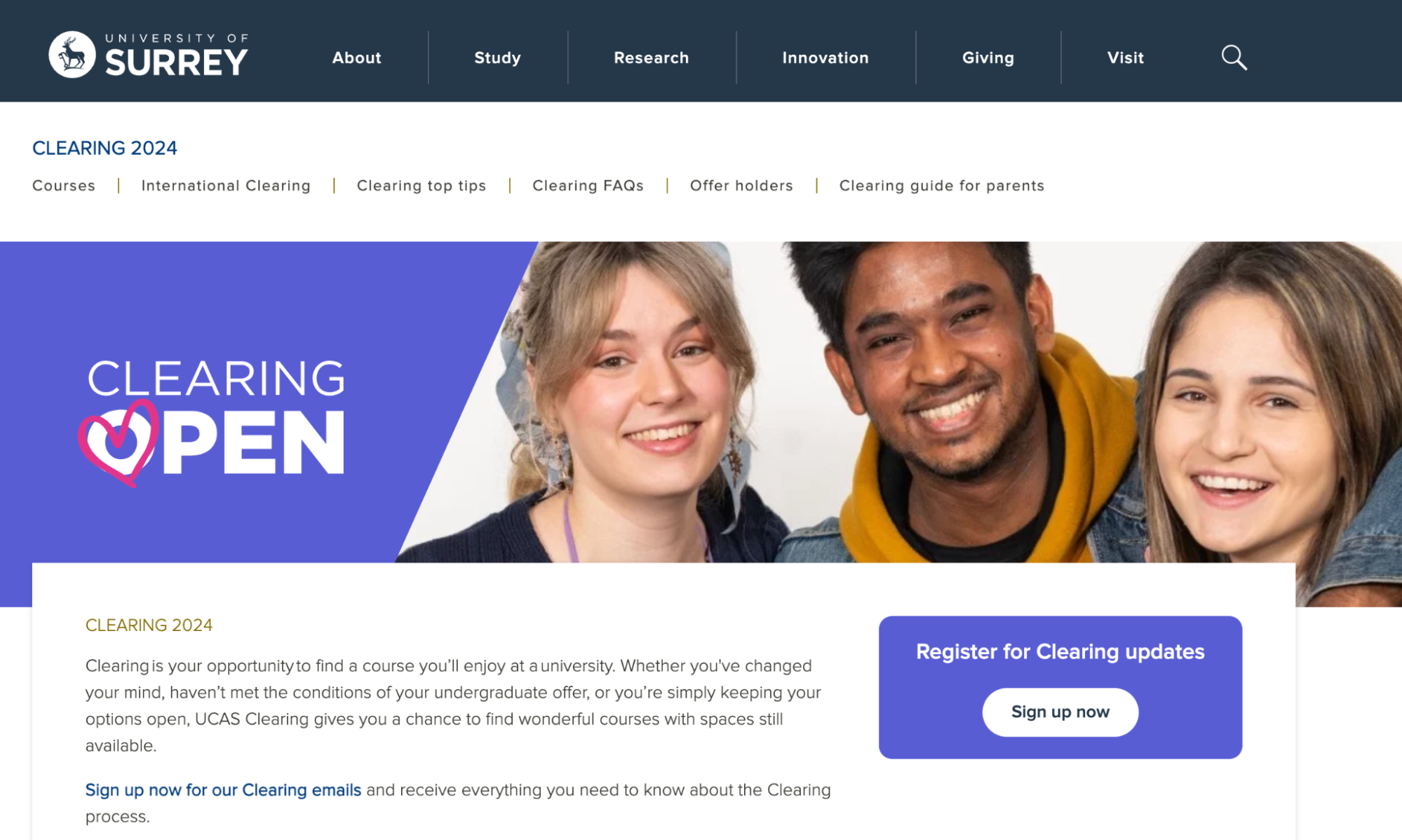
1. University of Surrey - Clearing for international students with email campaigns
University of Surrey’s Clearing page offers straightforward details on the Clearing process, eligibility, and key dates.
They’re using an email marketing approach and capturing prospective students' information early, enabling personalized communication and support throughout the Clearing process.
This proactive approach helps the university identify and engage with interested students, ensuring they receive timely updates and assistance, which can improve conversion rates and student satisfaction.
It streamlines the process for students, making it easier for them to navigate Clearing and find suitable courses.
They’ve also set up a specific page for international students, with a clean layout and dedicated sections on visa requirements, English language qualifications, and student support services.
They’ve made sure to add multiple contact options including phone numbers, email addresses, and live chat, as well as helpful resources like accommodation options, student life information, and financial guidance.
They also highlight guaranteed accommodation and student life resources, along with supportive features like webinars and one-on-one chats with academics.
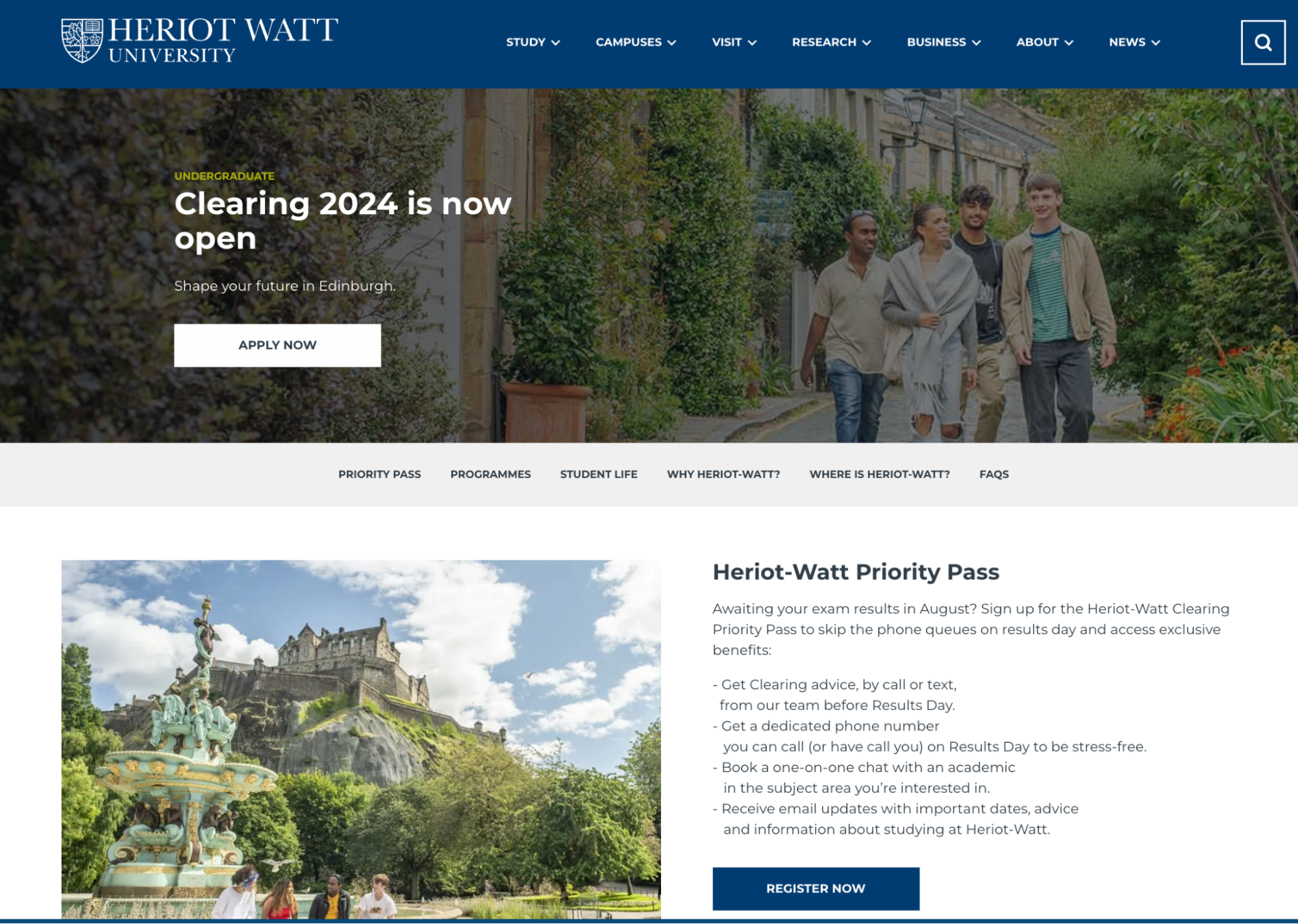
2. Heriot-Watt University’s Priority Pass
Heriot-Watt University’s Clearing page is highly effective in guiding prospective students through the Clearing process.
The Priority Pass feature allows students to skip phone queues and receive personalized support, enhancing the user experience for students.
They can avoid the queue on the Clearing phone line, get Clearing advice, by call or text, from the University team before Results Day, book a 1-2-1 online chat with an academic in the subject area they’re interested in, and receive email updates.
This makes it easier for students to quickly and efficiently connect with university staff, reducing stress and wait times during the Clearing process, which can be a difficult time for students.
Tailored sections cater to different student groups, including international and widening participation applicants, as well as additional information on dates and courses.
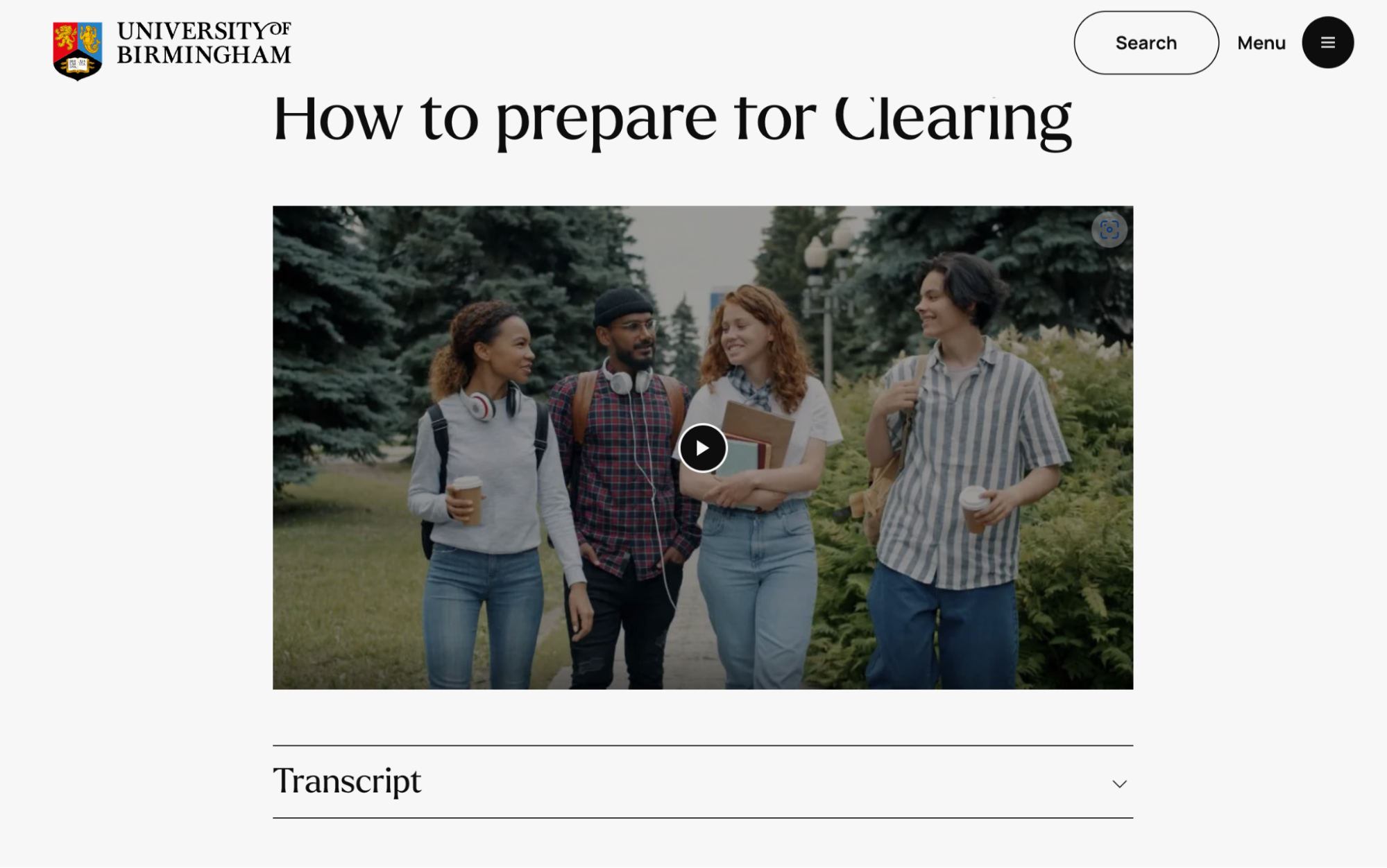
3. University of Birmingham's video prep guides
University of Birmingham’s Clearing page highlights a video that guides prospective students through the Clearing process.
It provides a clear and engaging overview of what Clearing entails, how to prepare, and the steps to secure a place at the university.
This video is an excellent tool because it visually and succinctly conveys critical information, reduces anxiety by demystifying the process, and showcases the university’s commitment to supporting students through this pivotal time—in a format we know students love: video!
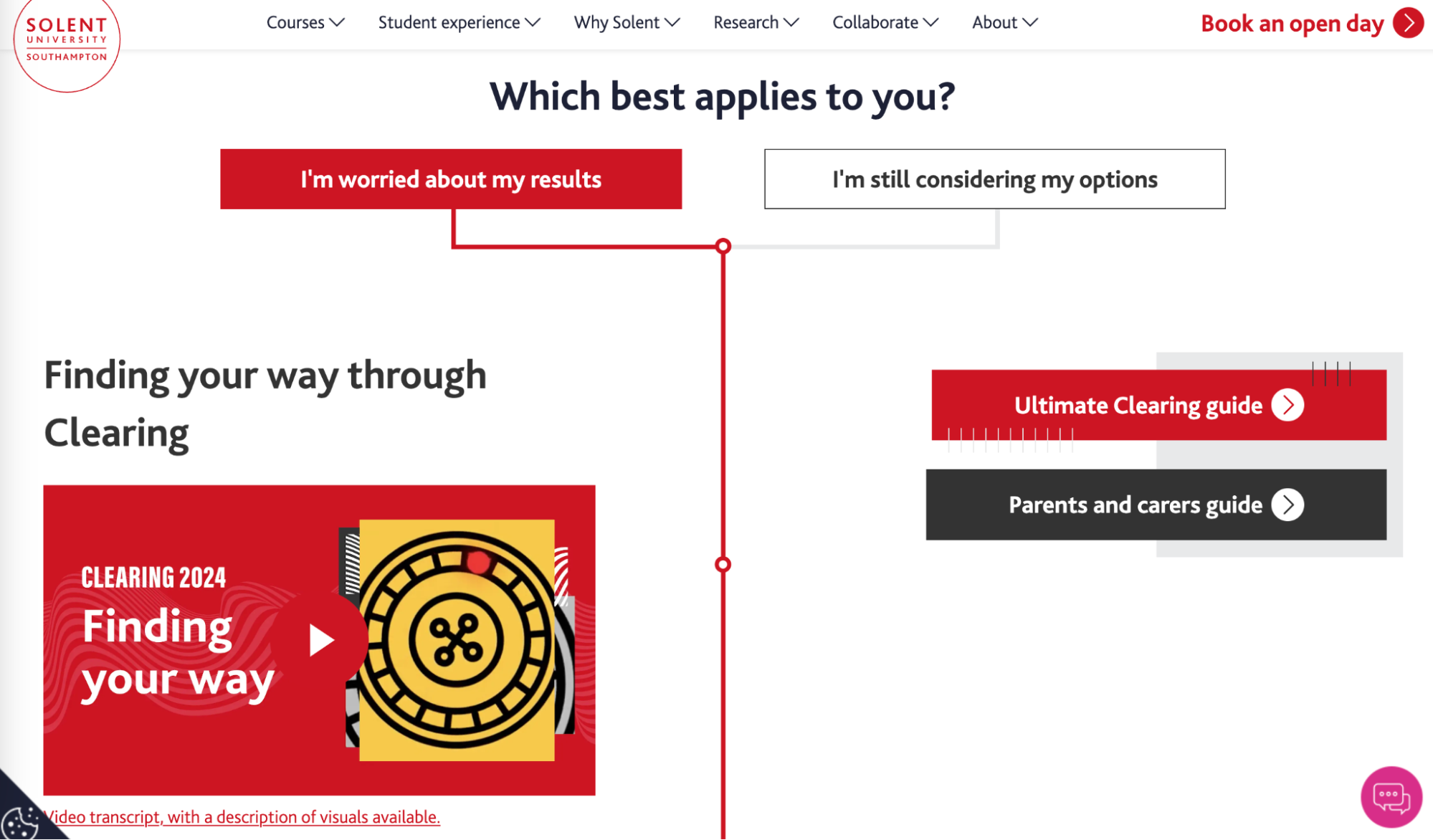
4. Solent University—Simplifying the journey with a flowchart
Solent University’s very clever Clearing page effectively simplifies the Clearing process by breaking it down into clear, manageable steps… in a visual flowchart.
It visually guides students from initial eligibility checks through to securing a place, making the process less daunting.
This is a really straightforward, visual explanation that can help reduce anxiety and confusion among prospective students, encouraging them to engage with the Clearing process confidently.
Additionally, at each step, they’ve added smart sections with student testimonials, videos on Southhampton, accommodation, a dedicated hotline, and a live chat feature for immediate assistance.
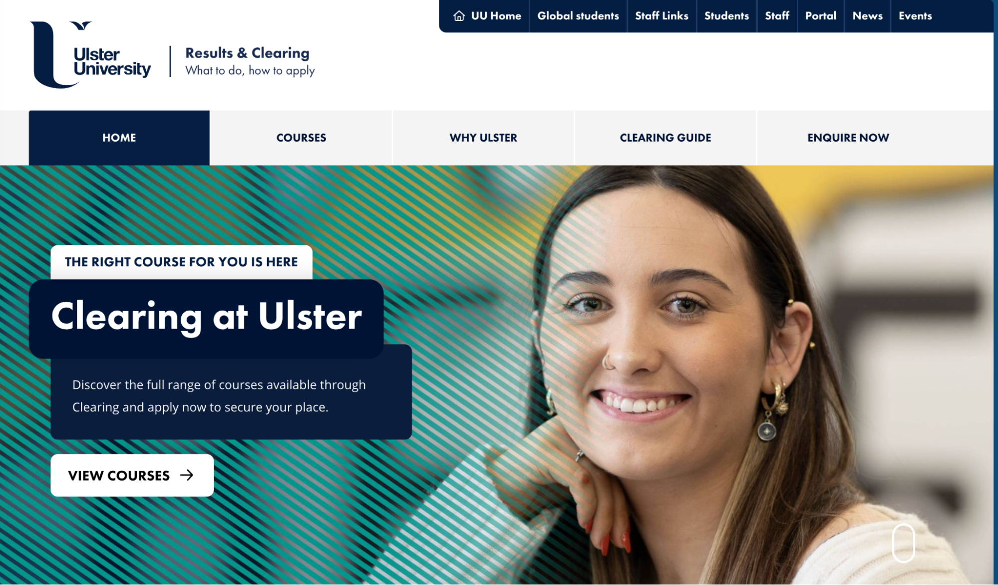
5. Ulster University’s Clearing mini-website
Ulster University’s Clearing page is designed like a mini-website, offering an organized and immersive experience.
There are clear and distinct sections for eligibility, course details, application steps, and student support services.
This layout allows users to navigate easily and find relevant information quickly.
The visually appealing design, with clear headings and intuitive navigation, enhances student engagement and makes the Clearing process more approachable.
Videos, testimonials, clear calls to actions, and clearly labeled content blocks make it easy to browse and obtain information in bite-sized pieces.
There’s also clear navigation back to the University homepage and related content blocks to other sections of the website.
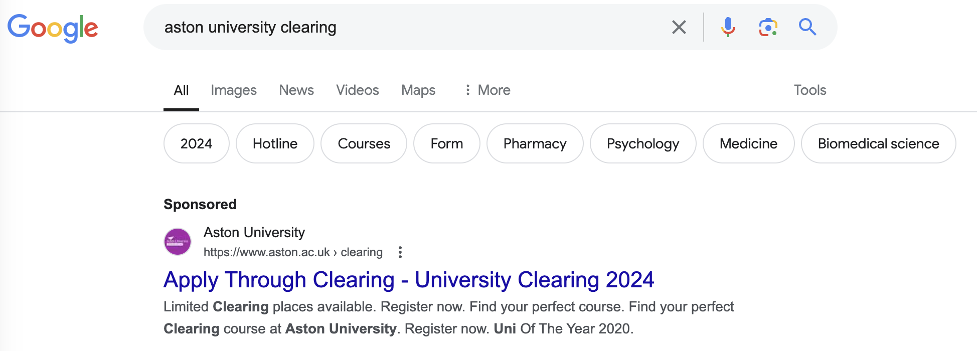
6. Aston University’s Sponsored Google Ads
Aston University’s Clearing page is featured as a sponsored ad on Google, which ensures high visibility to prospective students searching for Clearing opportunities (even when not searching specifically for Aston University!).
This strategic placement helps capture attention quickly and directs traffic to a well-organized page.
The ad effectively leverages search engine marketing to connect with students actively seeking university spots, maximizing outreach during the critical Clearing period.
As well as having a clean layout, the use of student testimonials and an FAQ section adds a personal touch, making the page informative and relatable.
They also have easy navigation and prominent call-to-action buttons to enhance the prospective students so they can quickly find and access the information they need.
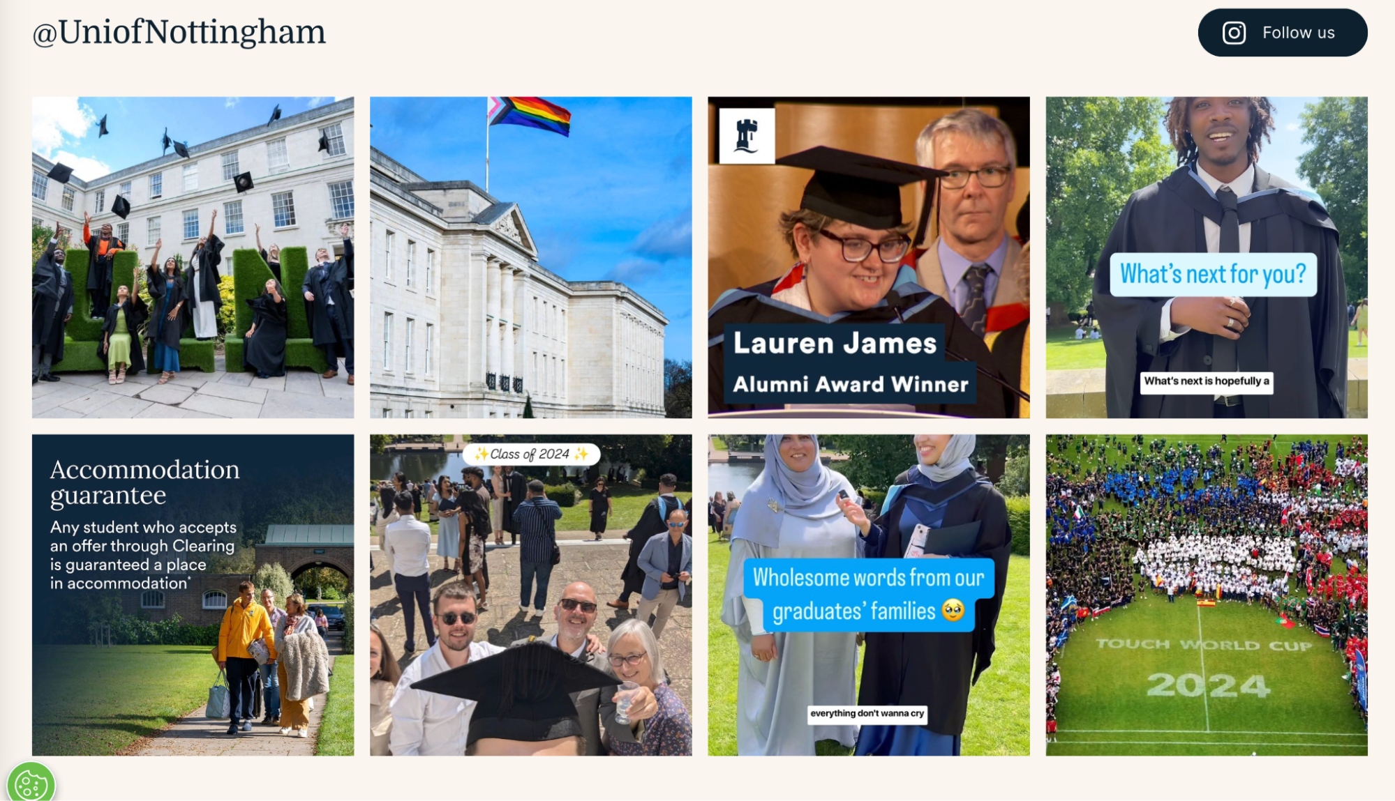
7. Nottingham University’s social media inclusion
University of Nottingham’s Clearing page effectively incorporates social media, enhancing engagement and outreach.
It features links to their active social media platforms, allowing prospective students to follow real-time updates and access additional support.
This integration helps students stay informed about the latest Clearing news and connect with the university community, fostering a sense of belonging even before enrollment.
Their Instagram posts feature the accommodation guarantee for any student that accepts a place during Clearing, and their page features other positive messages, with headings like “Clearing: you've got this.”
The social media presence also allows for interactive communication, where students can ask questions and receive timely responses.
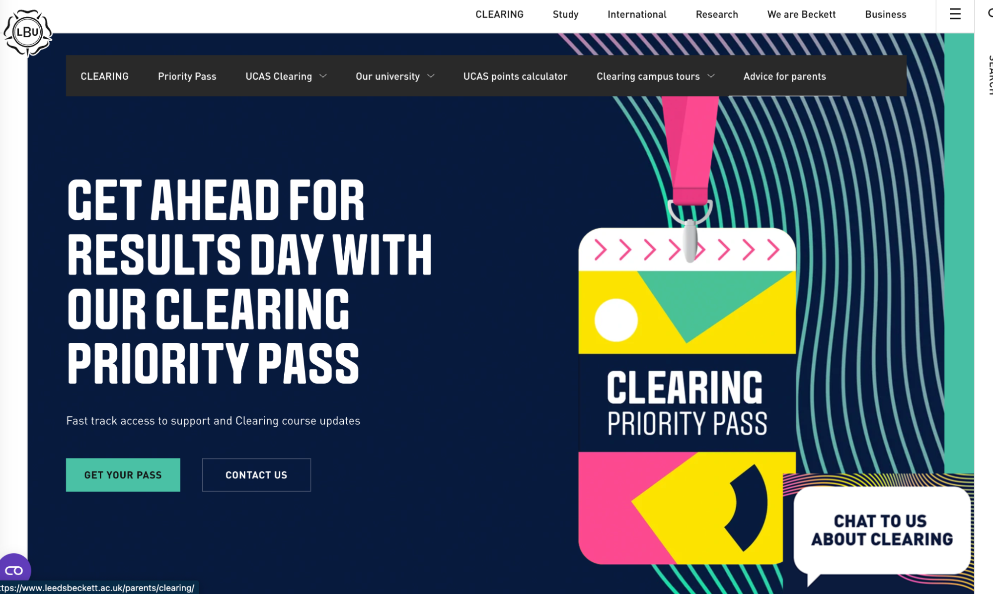
8. Leeds Beckett University’s Becky chatbot
Leeds Beckett University went all out for their Clearing page.
It features a clean and really vibrant and different design, using the university’s signature colors of purple and white with contrastic colors, and stands out with its energy.
This color scheme creates a visually appealing and professional look, enhancing readability and user experience.
The layout is well-structured, with clear headings and sections that guide users through the Clearing process.
High-quality images and student testimonials add a personal touch, while interactive elements like virtual tours and videos engage users, making the page informative and inviting. They also have a Priority Pass that looks like a backstage pass, for extra fun.
They’ve also incorporated Becky, the chatbot who answers questions 24/7, including a student blog experience of using this chatbot through Clearing.
And instead of creating a separate landing page, Leeds Beckett have reworked their main home page specifically with Clearing information.
Many universities are doing an amazing job of streamlining the process for prospective students, and there are many more examples.
How are you showcasing your offer for Clearing? Share your page with us on social media or in the comments below.

:format()//media/8-ways-to-stand-out-UK-Clearing--RQ.png)
